本文最后更新于 1890 天前,其中的信息可能已经有所发展或是发生改变。
转载地址: css动画之360首页四字移动动画
没有用的知识又增加了?
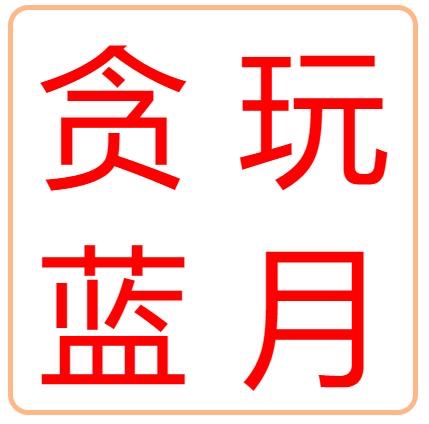
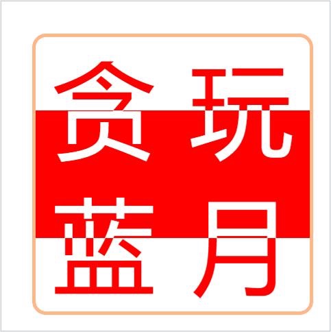
无意中打开了360首页,想找找有什么优秀的网站(比如7k7k、4399小游戏之类的)。咳咳~~~ 突然看到一个好看的玩意:
从事前端之后会有两个毛病,一个是编辑完一句话之后习惯ctrl+s 。
emmmmm 又来了。 另一个就是看到浏览器上有什么奇怪的玩意,喜欢 右击–检查 ing……

┗|`O′|┛ 嗷~~,看起来他是用 JS 写的呀~(谁说的,jq天下第一)。
于是,我这毛病又出来了,这么简单的动画不能用css 写嘛?
—- 说干就干。
大渣好,我系渣渣辉!
<div id="box">
  <div class="font">贪</div>
  <div class="font">玩</div>
  <div class="font">蓝</div>
  <div class="font">月</div>
</div>
#box {
  position: relative;
  font-size: 150px;
  width: 400px;
  height: 400px;
  margin: 50px auto;
  border: 5px solid #ffb787;
  border-radius: 5%;
  overflow: hidden;
}

#box .font {
  line-height: 200px;
  text-align: center;
  width: 200px;
  height: 200px;
  color: red;
  float: left;
}
咦~~就是这么敢单,还没怎么写就“感觉”快完成了!
来吧 背景不就是个红色方块嘛。
<div id="box">
  <div class="bg"></div>
  <!-- 加个红背景 -->
  <div class="font">贪</div>
  <div class="font">玩</div>
  <div class="font">蓝</div>
  <div class="font">月</div>
</div>
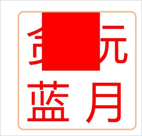
?????
本来以为就这么简单实现了,突然发现和最终效果有偏差啊!
仔细看了一下
在红色背景和文字的交界处,红色背景内的文字是白色的!!
头疼了一段时间想了想,白色背景红字是一个页面,而红色背景白色字体是另一个页面。
这个红色背景的压在白色背景的上面!!!
而动画的实现,是依靠四个角的盒子的width,height的改变!
好吧是我想的太简单 (+_+)? 好的 ,不慌、不慌 现在思路明确了,咱们开撸!
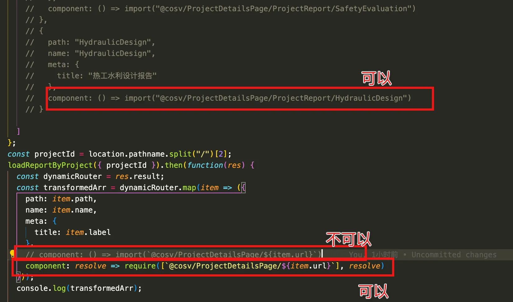
<div id="box">
  <div class="font">贪</div>
  <div class="font">玩</div>
  <div class="font">蓝</div>
  <div class="font">月</div>
  <div class="po1">
    <div>贪</div>
  </div>
  <div class="po2">
    <div>玩</div>
  </div>
  <div class="po3">
    <div>蓝</div>
  </div>
  <div class="po4">
    <div>月</div>
  </div>
</div>
html部分 ,我加上了四个盒子 po1,po2,po3,po4。分别给这四个盒子设置overflow:hidden通过控制他们的宽高,来实现隐藏显示内部的字,并且都给他们定位到中间,默认高宽为0。
.po1,
.po2,
.po3,
.po4 {
  overflow: hidden;
  position: absolute;
  background: red;
  width: 0;
  height: 0;
}
.po1 {
  right: 200px;
  bottom: 200px;
}
.po2 {
  left: 200px;
  bottom: 200px;
}
.po3 {
  right: 200px;
  top: 200px;
}
.po4 {
  left: 200px;
  top: 200px;
}

.po1 div,
.po2 div,
.po3 div,
.po4 div {
  position: absolute;
  width: 200px;
  text-align: center;
  color: #fff;
}
.po1 div {
  bottom: 0;
  right: 0;
}
.po2 div {
  bottom: 0;
  left: 0;
}
.po3 div {
  right: 0;
  top: 0;
}
.po4 div {
  top: 0;
  left: 0;
}
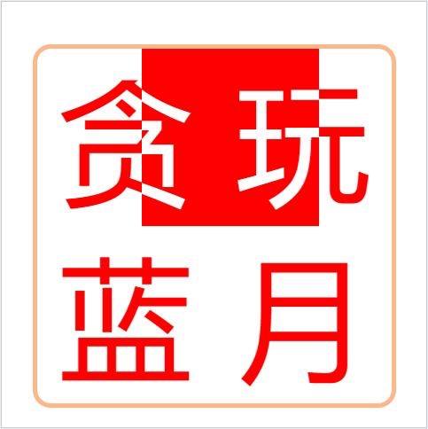
好的 现在四个盒子都被定位在盒子最中间了。
先加一个动画试试把!
@keyframes w-h {
  0% {    height: 0;    width: 200px;  }
  50% {    height: 200px;    width: 200px;  }
  100% {    height: 200px;    width: 0;  }
}

.po1 {
  animation: w-h 2s infinite linear;
}
.po2 {
  animation: w-h 2s infinite linear;
}
.po3 {
  animation: w-h 2s infinite linear;
}
.po4 {
  animation: w-h 2s infinite linear;
}
看起来有点意思啦~
现在咱们再调整一下动画的帧 ,和四个盒子的动画延迟时间和方现:
@keyframes w-h {
  0% {    height: 0;    width: 200px;  }
  25% {    height: 200px;    width: 200px;  }
  50% {    height: 200px;    width: 0;  }
}
.po1 {  animation: w-h 2s 0.5s infinite linear;}
.po2 {  animation: w-h 2s infinite linear reverse; /* reverse 反向动画 */}
.po3 {  animation: w-h 2s 1s infinite linear reverse;}
.po4 {  animation: w-h 2s 1.5s infinite linear;}
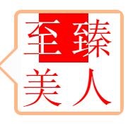
效果预览预览:
哈哈,终于实现了呢,看来有些东西,真的是看起来简单,写起来才知道坑点呢。